Visual Design
Color Scheme and Contrast
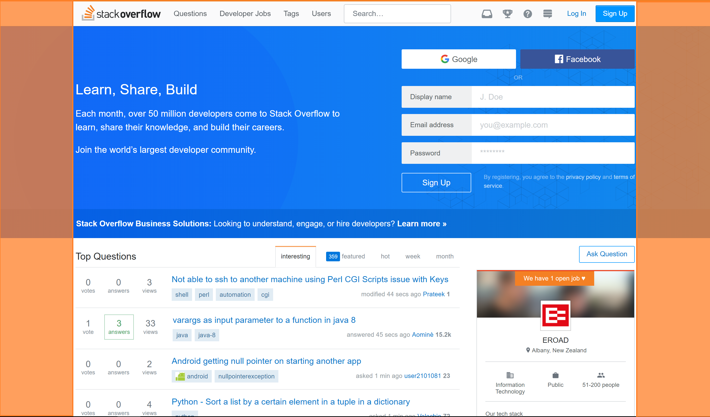
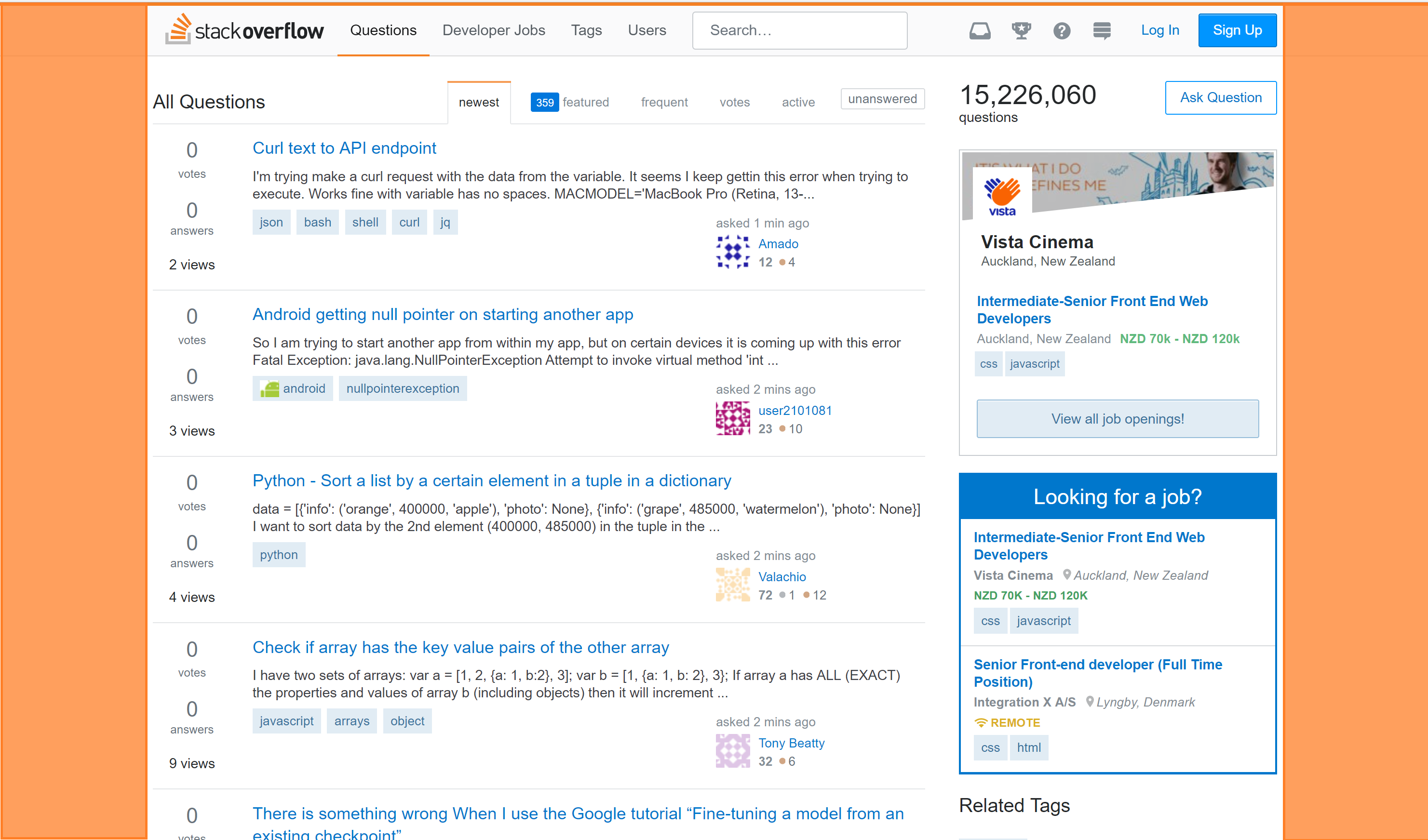
All the interface elements on 'stack overflow' use a white and blue color scheme.
This is good as it increases the continuity between pages and creates a sense of familiarity with users when they navigate to a new page on the website.
Making the background white creates excellent contrast with the black text on the page making it very easy to read.
There are some drawbacks to this grey text. Texts on the website are light grey. It could be not a proper color for readability depending on monitors.(Figure 1.)
Typography
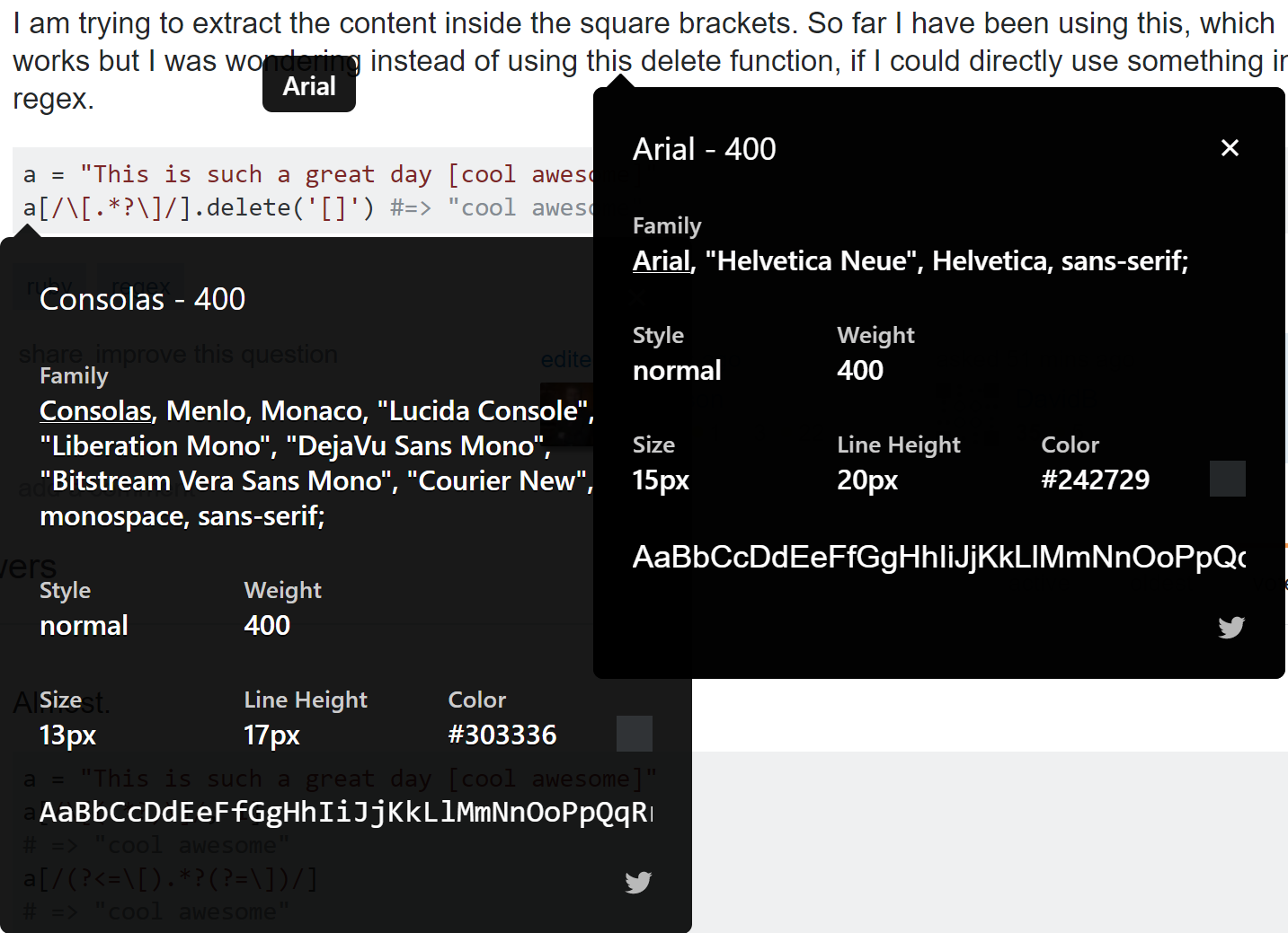
'Stack overflow' uses different fonts to convey the text and the code at a glance.
Consolas and Arial font in paragraphs of information is a good choice for two reasons as below:
1. Readers do not want to strain their eyes reading large paragraphs of text. As all the paragraphs are written in these simple Arial fonts, they are clear and easy to read.
2. Arial front is not particularly eye-catching therefore they do not distract the reader while they are looking through other elements on the page.
Bear(2015) quotes "avoid the temptation to use boldface text to emphasize words within a passage of text.
Bold text is like a magnet to our eyes, and if used incorrectly, ruins the continuity of your text."
Balance and White Space
Stack overflow uses balance and the distribution of white space in order users to focus attention on the important content on the website and establish consistency between pages on the website. The elements on the ‘Questions’, ‘Developers jobs’, 'Tags' and ‘Users’ pages on the site are arranged inside a central column. There are blocks of whitespace on either side of this column between the elements on the page and the edge of the page. Bear (2015) highlights this is a symmetrical style of balance as 'the page elements are centered'. The similarity in balance between these two pages is good since this implies that users will know where to look on the page to see the content. This style of balance also creates a sense of order on the website as no single side of the page seems ‘heavier’ or more cluttered than the other.
Proximity and Unity
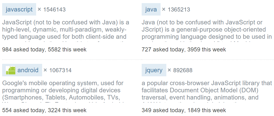
Many pages on 'Stack overflow' have multiple elements that discuss similar topics or convey related information.
The website groups these elements together and borders them with light grey lines.
Bear(2015) quotes that it is important to ‘help the viewer understand complex pages or information-packed layouts by using proximity to bring together elements
that go together’ This is an excellent example of proximity in action that lets users know that the grouped elements are all related
while the light grey lines reinforce that they are all separate elements.
'Stack overflow' usually separates unrelated elements by placing them on different pages.
For example all the information about the 'developers jobs' service is located on the developers jobs page
therefore there is no need to separate the elements on that page
as they are all related to the developers jobs in some ways.
Since how rarely the website clearly has to separate elements on pages, there is no established visual design technique employed to do this.
The only real example of separating elements on the same page would be the navigation bar.
This is done by keeping the navigation bar the same when everything else on the page changes - if ony the content changes but the navigation bar does not,
the navigation bar cannot be related to the rest of the elements on the page displaying the content.
This causes users to disassociate the bar with the rest of the content on the page much in the same way proximity does.
Proximity is used to make the navigation bar very intuitive, however a few oddly placed elements can confuse users.
There is a section for the 'open job' on the right side of the website on the first page next to qustions. Bear (2015) mentions
that 'how close together objects are placed can suggest a relationship'. This can mislead users into thinking that these section is also for questions and answers
as they are close to the question list. This means that users may have difficulty finding the unity.
The rest of the elements on the navigation bar are grouped together very intuitively which makes the navigation bar very easy to use, which means
users can identify the functionality of elements based purely on their position.
Repetition
(Figure 4,5,6,7) shows that the content on the pages are aligned to the center.
According to (Bear, J, H. 2015) ‘Repeating the… placement of elements... provides a comforting rhythm to a publication’.
Repetition is used to great effects on the blog page of the website. All the titles on the page are colored light blue and use ‘Arial’ font family,
and all the paragraphs are in standard Consolas. This allows the user to quickly identify which text is important and which isn’t.
It also makes it more obvious when users start reading a new question as they will see the big blue text.
Alignment
Text and images on the rest of the website are usually aligned to the center or are in a grid formation. This is an excellent design choice as it makes them easy to read and understand. (Bear, J, H. 2015) says that good alignment creates 'attractive, readable pages'. Constantly breaking alignment would make text difficult to read making the website harder to use and frustrating visitors.